In this tutorial, you will learn how to create a color picker with angular from scratch.
We will take a look at how to use the HTML-canvas together with angular to create the rainbow-like effect we are all used to.
Also, we will discover how to create a basic drag&drop functionality using the canvas.
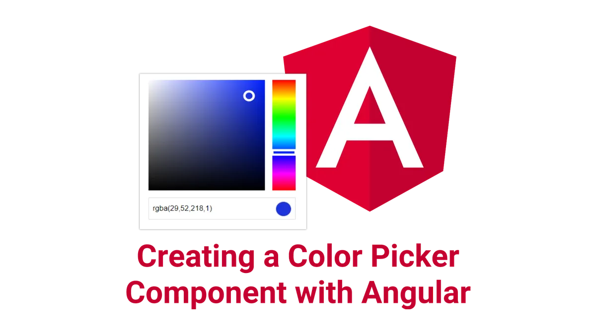
At the end, we will end up with a material design color picker that looks likes this:
Let’s get started!

A new angular project for the color picker
Before we get started, we need an angular project to work on. In this tutorial, we are going to generate a new angular-cli project. If you want to use an existing project, that should be fine, too.
To generate a new project, make sure you have the angular-cli installed and use this command at the desired project destination:
ng new angular-color-picker
When the tool is done, we want to create a new module for our color-picker to keep things tidy. To do so, we again use the angular-cli to generate that module for us.
ng generate module color-picker
Afterward, we also create a component with the same name. This will be the root-component of our color-picker:
ng generate component color-picker
Once that is done, make sure that the new color-picker component is declared in the color-picker module instead of the app module. Also, we want to make sure, that the color-picker component is exported, so it can be used outside of the module:
import { NgModule } from '@angular/core'
import { CommonModule } from '@angular/common'
import { ColorPickerComponent } from './color-picker.component'
@NgModule({
imports: [CommonModule],
declarations: [ColorPickerComponent],
exports: [ColorPickerComponent],
})
export class ColorPickerModule {}Finally, we import the color-picker module into the app module
import { BrowserModule } from '@angular/platform-browser'
import { NgModule } from '@angular/core'
import { AppComponent } from './app.component'
import { ColorPickerModule } from './color-picker/color-picker.module'
@NgModule({
declarations: [AppComponent],
imports: [BrowserModule, ColorPickerModule],
providers: [],
bootstrap: [AppComponent],
})
export class AppModule {}and use the color-picker component in the apps’ template:
<app-color-picker></app-color-picker>
How to create a color-slider to select the hue using an HTML-canvas
The first thing we are going to create is the vertical slider on the right side of the picker. This slider is selecting the hue of the color.

Creating a color-slider component
To get started, let’s create a new component called “color-slider” in the color-picker directory.
To generate the component, we can use the angular-cli using this command:
ng generate component color-picker/color-slider
Using a canvas in angular
To draw all the different colors, we are going to need a HTML-canvas. We can create one by using the canvas-tag in our template. While we are add it, we also assign that tag an identifier, a class and define its width and height.
<canvas #canvas class="color-slider" width="50" height="250"> </canvas>To use this canvas with angular, we need a reference to the HTML-element. We can get this in a save way by using the angular @ViewChild decorator. The value the decorator takes is the identifier we have assigned to the canvas (#canvas).
@ViewChild('canvas')
canvas: ElementRef<HTMLCanvasElement>;
How to draw on a canvas
Now that we have a reference to the canvas, we can start drawing onto it.
Do that, let’s create a method called “draw” inside of the color-slider component.
draw() {
}
To draw on the canvas, we first need an object called context. We can get this context by calling the “getContext” method on the canvas-element. Once we have that context, we store it into a private field of the class called ctx.
private ctx: CanvasRenderingContext2D;
draw() {
if (!this.ctx) {
this.ctx = this.canvas.nativeElement.getContext('2d');
}
}
Also, we use the reference to the canvas element to get its with and height, as we will need it later. Also, we clear the whole canvas using clearRect.
draw() {
if (!this.ctx) {
this.ctx = this.canvas.nativeElement.getContext('2d');
}
const width = this.canvas.nativeElement.width;
const height = this.canvas.nativeElement.height;
this.ctx.clearRect(0, 0, width, height);
}
Drawing a rainbow-gradient
To create this rainbow-like effect for our color-slider, we are going to use a gradient. We want that gradient to fill the whole canvas so we pass it the height of the canvas.
draw() {
if (!this.ctx) {
this.ctx = this.canvas.nativeElement.getContext('2d');
}
const width = this.canvas.nativeElement.width;
const height = this.canvas.nativeElement.height;
this.ctx.clearRect(0, 0, width, height);
const gradient = this.ctx.createLinearGradient(0, 0, 0, height);
}
Afterward, we need to define the locations of the different colors in the gradient. For that we are defining so-called ColorStops. With these colorstops, we devide the gradient into 6 different sub-gradients.
draw() {
if (!this.ctx) {
this.ctx = this.canvas.nativeElement.getContext('2d');
}
const width = this.canvas.nativeElement.width;
const height = this.canvas.nativeElement.height;
this.ctx.clearRect(0, 0, width, height);
const gradient = this.ctx.createLinearGradient(0, 0, 0, height);
gradient.addColorStop(0, 'rgba(255, 0, 0, 1)');
gradient.addColorStop(0.17, 'rgba(255, 255, 0, 1)');
gradient.addColorStop(0.34, 'rgba(0, 255, 0, 1)');
gradient.addColorStop(0.51, 'rgba(0, 255, 255, 1)');
gradient.addColorStop(0.68, 'rgba(0, 0, 255, 1)');
gradient.addColorStop(0.85, 'rgba(255, 0, 255, 1)');
gradient.addColorStop(1, 'rgba(255, 0, 0, 1)');
}
For example, the first sub-gradient is a transition from red to yellow.
Now that we have defined the gradient, we also need to use it. To fill the whole canvas with this gradient, we simply draw a rectangle of the size of the canvas with the gradient as background-color.
draw() {
if (!this.ctx) {
this.ctx = this.canvas.nativeElement.getContext('2d');
}
const width = this.canvas.nativeElement.width;
const height = this.canvas.nativeElement.height;
this.ctx.clearRect(0, 0, width, height);
const gradient = this.ctx.createLinearGradient(0, 0, 0, height);
gradient.addColorStop(0, 'rgba(255, 0, 0, 1)');
gradient.addColorStop(0.17, 'rgba(255, 255, 0, 1)');
gradient.addColorStop(0.34, 'rgba(0, 255, 0, 1)');
gradient.addColorStop(0.51, 'rgba(0, 255, 255, 1)');
gradient.addColorStop(0.68, 'rgba(0, 0, 255, 1)');
gradient.addColorStop(0.85, 'rgba(255, 0, 255, 1)');
gradient.addColorStop(1, 'rgba(255, 0, 0, 1)');
this.ctx.beginPath();
this.ctx.rect(0, 0, width, height);
this.ctx.fillStyle = gradient;
this.ctx.fill();
this.ctx.closePath();
}
For this to have any effect at all, we need to call the draw method once we are sure, the canvas is already on the screen. A good place to do this, is inside of the ngAfterViewInit lifecycle hook.
ngAfterViewInit() {
this.draw();
}
Detecting mouse events on the color-slider
The next thing we will do is to turn our canvas into an actual slider. For that, we need to listen to mouse events as well as displaying the currently selected hue.
Let’s start by adding mousedown and mousemove event listeners. For that, we modify our template like this:
<canvas
#canvas
class="color-slider"
width="50"
height="250"
(mousedown)="onMouseDown($event)"
(mousemove)="onMouseMove($event)"
>
</canvas>Next, we implement the used callbacks in our color-slider component class.
The mousedown callback
When the mouse is down, we first want to save that state. To that, we create a private field on the class called “mousedown”. Also, we need to keep track, wich height was selected. We need this height to display a nob at that position.
private mousedown: boolean = false;
private selectedHeight: number;
onMouseDown(evt: MouseEvent) {
this.mousedown = true;
this.selectedHeight = evt.offsetY;
this.draw();
this.emitColor(evt.offsetX, evt.offsetY);
}
Afterward, we want to trigger the draw method. We do so to update the position of the selection-nob, which we will implement later. Finally, we call the emitColor method, which we also have to implement later. It is responsible for reading the selected color value and communicating that change to the parent component.
What to do when the mouse moves
When the mouse moves, the first thing we want to do is to check if our “mousedown”-property is set to true. That is because we only want to react if the user is dragging the slider.
When that happens, we basically want to do the same things as when the mouse was first down. We update the selected height, redraw our canvas and emit the new color.
onMouseMove(evt: MouseEvent) {
if (this.mousedown) {
this.selectedHeight = evt.offsetY;
this.draw();
this.emitColor(evt.offsetX, evt.offsetY);
}
}
Registering to a global mouse-up event
Finally, we also need to know when the user stops holding the mouse-button down. Because at that point, the mouse could have already left our canvas, we need to register that event listener globally. Otherwise, we could end up with our mousedown-property stuck on true.
To do that, we use the @HostListener decorator, which is just a fancy way of registering an event-callback in angular.
@HostListener('window:mouseup', ['$event'])
onMouseUp(evt: MouseEvent) {
this.mousedown = false;
}
Missing methods
It turns out, we still need to implement two methods we have called before. One missing method is emitColor. This method is reading the the color at the selected position and is emitting it using the components color-emitter;
emitColor(x: number, y: number) {
const rgbaColor = this.getColorAtPosition(x, y);
this.color.emit(rgbaColor);
}
As you can see, this method is using another method called getColorAtPosition. This method is using the canvas context to read out the color at the given position.
getColorAtPosition(x: number, y: number) {
const imageData = this.ctx.getImageData(x, y, 1, 1).data;
return 'rgba(' + imageData[0] + ',' + imageData[1] + ',' + imageData[2] + ',1)';
}
Drawing the slider nob of the color-slider
Next, it is time to update the draw method to indicate the current color with a nob (which will be a simple rectangle in our case).
All we need to do, is to add this code at the end of the method:
if (this.selectedHeight) {
this.ctx.beginPath()
this.ctx.strokeStyle = 'white'
this.ctx.lineWidth = 5
this.ctx.rect(0, this.selectedHeight - 5, width, 10)
this.ctx.stroke()
this.ctx.closePath()
}What we do here is drawing a transparent rectangle with a white border of 5px at the selectedHeight (offset to be centered).
That’s already it. because the draw method is called every time selectedHeight changes, the nob always indicates the currently selected value.
The full component
So here is what our component looks like by now:
import {
Component,
ViewChild,
ElementRef,
AfterViewInit,
Output,
HostListener,
EventEmitter,
} from '@angular/core'
@Component({
selector: 'app-color-slider',
templateUrl: './color-slider.component.html',
styleUrls: ['./color-slider.component.css'],
})
export class ColorSliderComponent implements AfterViewInit {
@ViewChild('canvas')
canvas: ElementRef<HTMLCanvasElement>
@Output()
color: EventEmitter<string> = new EventEmitter()
private ctx: CanvasRenderingContext2D
private mousedown: boolean = false
private selectedHeight: number
ngAfterViewInit() {
this.draw()
}
draw() {
if (!this.ctx) {
this.ctx = this.canvas.nativeElement.getContext('2d')
}
const width = this.canvas.nativeElement.width
const height = this.canvas.nativeElement.height
this.ctx.clearRect(0, 0, width, height)
const gradient = this.ctx.createLinearGradient(0, 0, 0, height)
gradient.addColorStop(0, 'rgba(255, 0, 0, 1)')
gradient.addColorStop(0.17, 'rgba(255, 255, 0, 1)')
gradient.addColorStop(0.34, 'rgba(0, 255, 0, 1)')
gradient.addColorStop(0.51, 'rgba(0, 255, 255, 1)')
gradient.addColorStop(0.68, 'rgba(0, 0, 255, 1)')
gradient.addColorStop(0.85, 'rgba(255, 0, 255, 1)')
gradient.addColorStop(1, 'rgba(255, 0, 0, 1)')
this.ctx.beginPath()
this.ctx.rect(0, 0, width, height)
this.ctx.fillStyle = gradient
this.ctx.fill()
this.ctx.closePath()
if (this.selectedHeight) {
this.ctx.beginPath()
this.ctx.strokeStyle = 'white'
this.ctx.lineWidth = 5
this.ctx.rect(0, this.selectedHeight - 5, width, 10)
this.ctx.stroke()
this.ctx.closePath()
}
}
@HostListener('window:mouseup', ['$event'])
onMouseUp(evt: MouseEvent) {
this.mousedown = false
}
onMouseDown(evt: MouseEvent) {
this.mousedown = true
this.selectedHeight = evt.offsetY
this.draw()
this.emitColor(evt.offsetX, evt.offsetY)
}
onMouseMove(evt: MouseEvent) {
if (this.mousedown) {
this.selectedHeight = evt.offsetY
this.draw()
this.emitColor(evt.offsetX, evt.offsetY)
}
}
emitColor(x: number, y: number) {
const rgbaColor = this.getColorAtPosition(x, y)
this.color.emit(rgbaColor)
}
getColorAtPosition(x: number, y: number) {
const imageData = this.ctx.getImageData(x, y, 1, 1).data
return (
'rgba(' + imageData[0] + ',' + imageData[1] + ',' + imageData[2] + ',1)'
)
}
}We need some style…
For our slider to look like in the example, we need to add the following styles:
.color-palette:hover {
cursor: pointer;
}
How to create a color-palette using the HTML-canvas
Now that we have finished our slider, it is time to work on the other color-palette on the left side of the picker.
ng generate component color-picker/color-palette
Actually, this palette is working exactly like the color-slider we have build before.
The only difference here is, that this component has an input which is will be the hue we have selected with our slider. Based on this hue, the gradients in the draw method have a different color.
Component class
So without further ado, here is the full component:
import {
Component,
ViewChild,
ElementRef,
AfterViewInit,
Input,
Output,
SimpleChanges,
OnChanges,
EventEmitter,
HostListener,
} from '@angular/core'
@Component({
selector: 'app-color-palette',
templateUrl: './color-palette.component.html',
styleUrls: ['./color-palette.component.css'],
})
export class ColorPaletteComponent implements AfterViewInit, OnChanges {
@Input()
hue: string
@Output()
color: EventEmitter<string> = new EventEmitter(true)
@ViewChild('canvas')
canvas: ElementRef<HTMLCanvasElement>
private ctx: CanvasRenderingContext2D
private mousedown: boolean = false
public selectedPosition: { x: number; y: number }
ngAfterViewInit() {
this.draw()
}
draw() {
if (!this.ctx) {
this.ctx = this.canvas.nativeElement.getContext('2d')
}
const width = this.canvas.nativeElement.width
const height = this.canvas.nativeElement.height
this.ctx.fillStyle = this.hue || 'rgba(255,255,255,1)'
this.ctx.fillRect(0, 0, width, height)
const whiteGrad = this.ctx.createLinearGradient(0, 0, width, 0)
whiteGrad.addColorStop(0, 'rgba(255,255,255,1)')
whiteGrad.addColorStop(1, 'rgba(255,255,255,0)')
this.ctx.fillStyle = whiteGrad
this.ctx.fillRect(0, 0, width, height)
const blackGrad = this.ctx.createLinearGradient(0, 0, 0, height)
blackGrad.addColorStop(0, 'rgba(0,0,0,0)')
blackGrad.addColorStop(1, 'rgba(0,0,0,1)')
this.ctx.fillStyle = blackGrad
this.ctx.fillRect(0, 0, width, height)
if (this.selectedPosition) {
this.ctx.strokeStyle = 'white'
this.ctx.fillStyle = 'white'
this.ctx.beginPath()
this.ctx.arc(
this.selectedPosition.x,
this.selectedPosition.y,
10,
0,
2 * Math.PI,
)
this.ctx.lineWidth = 5
this.ctx.stroke()
}
}
ngOnChanges(changes: SimpleChanges) {
if (changes['hue']) {
this.draw()
const pos = this.selectedPosition
if (pos) {
this.color.emit(this.getColorAtPosition(pos.x, pos.y))
}
}
}
@HostListener('window:mouseup', ['$event'])
onMouseUp(evt: MouseEvent) {
this.mousedown = false
}
onMouseDown(evt: MouseEvent) {
this.mousedown = true
this.selectedPosition = { x: evt.offsetX, y: evt.offsetY }
this.draw()
this.color.emit(this.getColorAtPosition(evt.offsetX, evt.offsetY))
}
onMouseMove(evt: MouseEvent) {
if (this.mousedown) {
this.selectedPosition = { x: evt.offsetX, y: evt.offsetY }
this.draw()
this.emitColor(evt.offsetX, evt.offsetY)
}
}
emitColor(x: number, y: number) {
const rgbaColor = this.getColorAtPosition(x, y)
this.color.emit(rgbaColor)
}
getColorAtPosition(x: number, y: number) {
const imageData = this.ctx.getImageData(x, y, 1, 1).data
return (
'rgba(' + imageData[0] + ',' + imageData[1] + ',' + imageData[2] + ',1)'
)
}
}Also, because this component is expecting an input, we have to redraw the whole thing when the input changes. We do so in the ngOnChanges lifecycle hook.
Template
Again, the component template looks exactly like the one for the spinner:
<canvas
#canvas
class="color-palette"
width="250"
height="250"
(mousedown)="onMouseDown($event)"
(mousemove)="onMouseMove($event)"
>
</canvas>Styles
The same goes for the styles:
.color-palette:hover {
cursor: pointer;
}
:host {
width: 250px;
height: 250px;
display: block;
}
Bringing it all together to create the color picker
Alright, we have mastered the hardest part already. All we need to do now, is to bring both components together to form an actual color picker.
The design is quite simple: Other than our two components, it is just a span and a rounded div to show the current color. Also, there are some wrappers…
<div class="color-wrapper">
<app-color-palette [hue]="hue" (color)="color = $event"></app-color-palette>
<app-color-slider
(color)="hue=$event"
style="margin-left:16px"
></app-color-slider>
</div>
<div class="input-wrapper">
<span class="text">{{color}}</span>
<div
class="color-div"
[ngStyle]="{'background-color': color || 'white'}"
></div>
</div>Of course, we also need to provide the two properties “hue” and “color” in our component class:
import { Component } from '@angular/core'
@Component({
selector: 'app-color-picker',
templateUrl: './color-picker.component.html',
styleUrls: ['./color-picker.component.css'],
})
export class ColorPickerComponent {
public hue: string
public color: string
}Hue is the result of the color-slider, whereas color is the result of the color-palette.
And of course there are some boring styles…
Well, nothing exciting to see here. Just some flex-box-magic going on:
:host {
display: block;
width: 316px;
padding: 16px;
}
.color-wrapper {
display: flex;
height: 250px;
}
.input-wrapper {
margin-top: 16px;
display: flex;
border-radius: 1px;
border: 1px solid rgb(220, 220, 220);
padding: 8px;
height: 32px;
justify-content: center;
}
.color-div {
width: 32px;
height: 32px;
border-radius: 50%;
border: 1px solid rgb(220, 220, 220);
}
.text {
flex: 1;
font-family: 'Helvetica';
line-height: 32px;
}Conclusion
In this tutorial, you have learned how to create a color picker with angular.
You can find the full source code at the corresponding GitHub Repository.
If you liked this article, please share it with your friends! It would mean a lot to me.
Happy coding!